Platform specific properties
The Platform API allows us to conditionally apply different styles or properties in our component
based on the device’s operating system. The OS attribute of the object returns either iOS or android
depending on the user’s device.
Although this is a relatively simple way to apply different properties in our application based on
the user’s device, there may be scenarios where we may want our component to be substantially
different between operating systems.
We can also use the Platform.select method that takes the operating system as keys within an
object and returns the correct result based on the device:
1 | textStyle: { |
Separate files
Instead of applying conditional checks using Platform.OS a number times throughout the entire
component file, we can also leverage the use of platform specific files instead. We can create
two separate files to represent the same component each with a different extension: .ios.js and
.android.js . If both files export the same component class name, the React Native packager knows
to choose the right file based on the path extension. We’ll dive deeper into platform specific
differences later in this book.
Text input
We now have text fields that display the location, weather condition, and temperature. The next
thing we need to do is provide some sort of input to allow the user to search for a specific city.
Again, we’ll continue using hardcoded data for now. We’ll only begin using an API for real data
once we have all of our components in place.
React Native provides a built-in TextInput component that we can import into our component
that allows us to accept user input. Let’s include it within our View container underneath the Text
components (make sure to import it as well!):
1 | <Text style={[styles.largeText, styles.textStyle]}>San Francisco</Text> |
There are a number of props associated with TextInput that we can use. We’ll cover the basics
here but go into more detail about them in the “Core Components” chapter. Here we’re specifying
a placeholder, its color, as well as a style for the component itself. Let’s create its style object,
textInput , underneath our other styles:
1 | smallText: { |
As we mentioned previously, all the attributes that we provide styles with in React Native are
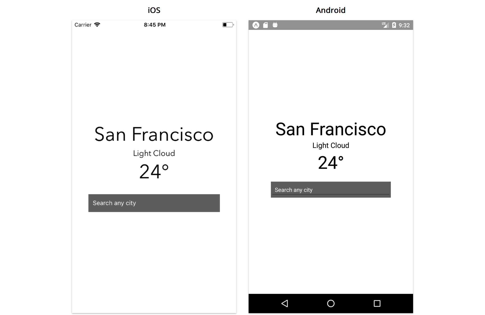
extremely similar to how we would apply them using CSS. Now let’s take a look at our application:

We can see that the text input has a default underline on Android. We’ll go over how to remove this
in a bit.
We’ve also specified the clearButtonMode prop to be always . This shows a button on the right side
of the input field when characters are inserted that allows us to clear the text. This is only available
on iOS.

If you’re using the iOS simulator, you can connect your hardware keyboard and use that with
any input field. This can be done with Shift + ⌘ + K or going to Hardware -> Keyboard ->
Connect Hardware Keyboard
With this enabled, the software keyboard may not show by default. You can toggle this by
pressing ⌘ + K or going to Hardware -> Keyboard -> Toggle Software Keyboard
Now every time you click an input field, the software keyboard will display exactly how it
would if you were using a real device and you can type using your hardware keyboard.
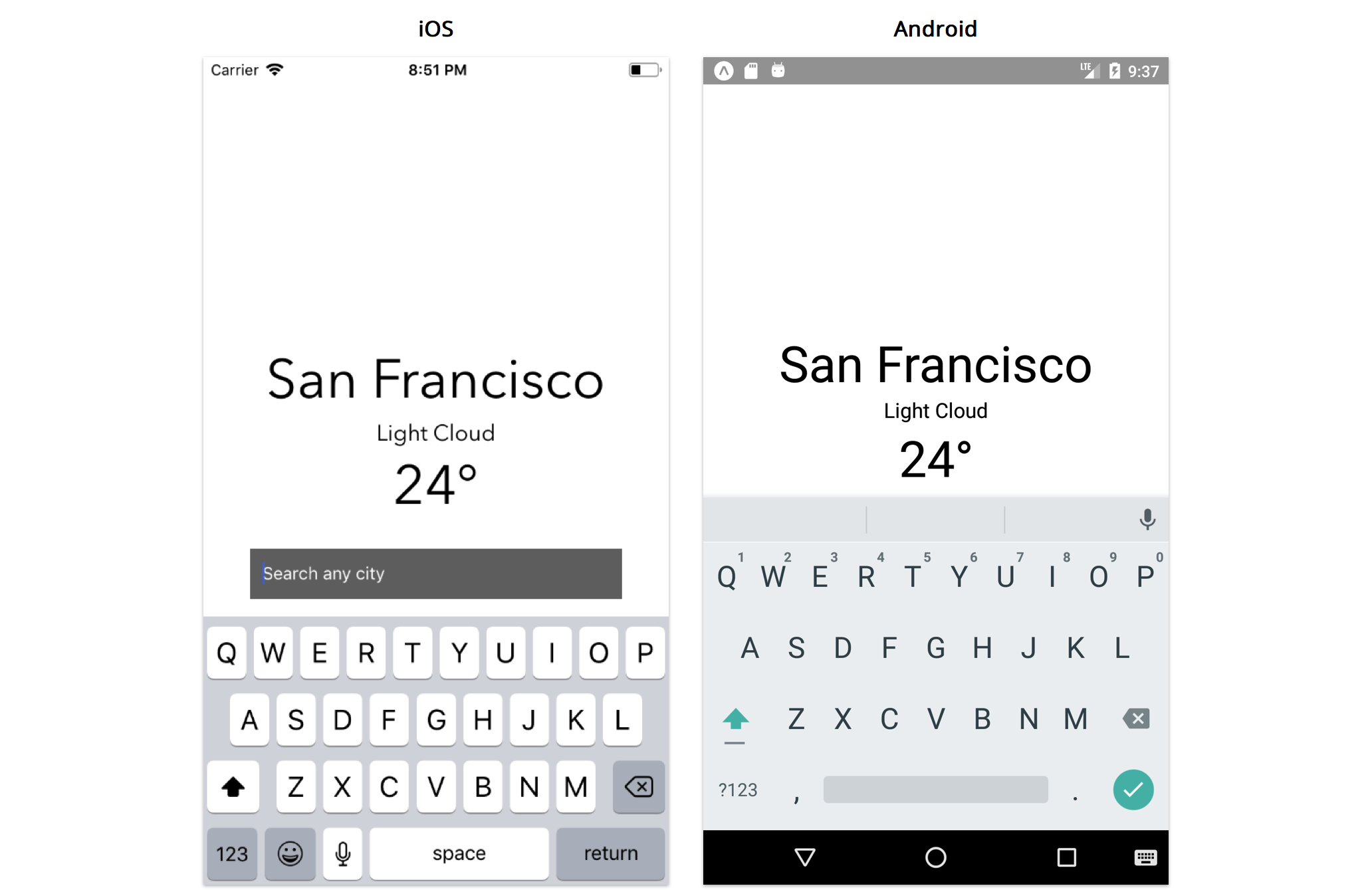
However one thing you may have noticed is that when you focus on the input field with a tap, the
keyboard pops up and covers it on Android and comes quite close on iOS:

Since the virtual keyboard can cover roughly half the device screen, this is a common prob-
lem that occurs when using text inputs in an application. Fortunately, React Native includes
KeyboardAvoidingView , a component that solves this problem by allowing us to adjust where other
components render in relation to the virtual keyboard. Let’s import and use this component instead
of View :
1 | render() { |
Notice that KeyboardAvoidingView accepts a behavior prop with which we can customize how the
keyboard adjusts. It can change its height, position or bottom padding in relation to the position of
the virtual keyboard. Here, we’ve specified padding .
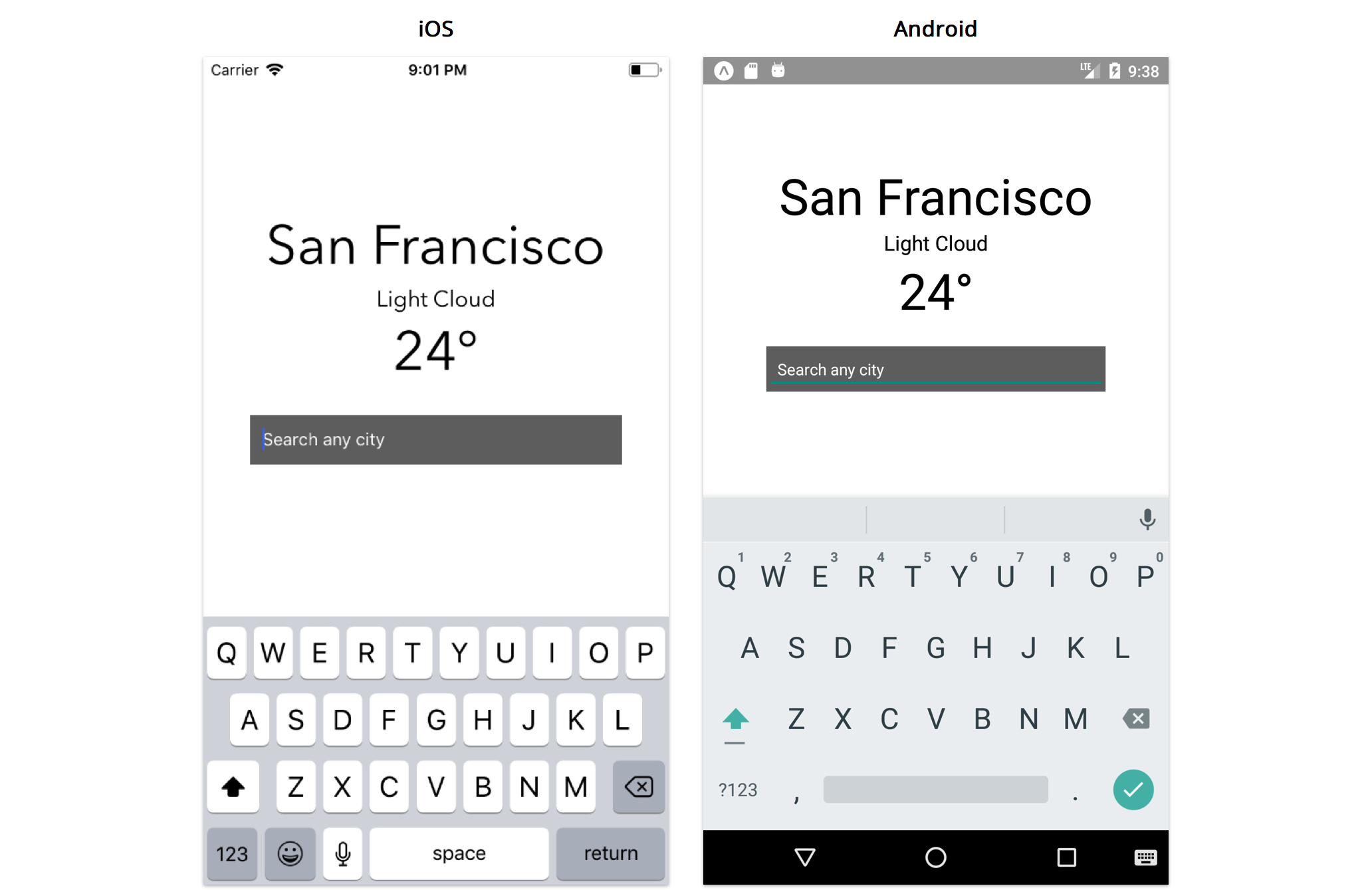
Now tapping the text input will shift our component text and input fields out of the way of the
software keyboard.

Custom components
So far, we’ve explored how to add styling into our application, and we’ve included some built-in
components into our main App component. We use View as our component container and import
Text and TextInput components in order to display hardcoded weather data as well as an input
field for the user to change locations.
It’s important to re-iterate that React Native is component-driven. We’re already representing our
application in terms of components that describe different parts of our UI without too much effort,
and this is because React Native provides a number of different built-in components that you can
use immediately to shape and structure your application.
However, as our application begins to grow, it’s important to begin thinking of how it can further
be broken down into smaller and simpler chunks. We can do this by creating custom components
that contain a small subset of our UI that we feel fits better into a separate, distinct component
file. This is useful in order to allow us to further split parts of our application into something more
manageable, reusable and testable.
Although our application in its current state isn’t extremely large or unmanageable, there’s still some
room for improvement. The first way we can refactor our component is to move our TextInput intoa separate component to hide its implementation details from the main App component. Let’s create
a components directory in the root of the application with the following file:
├── components/
- SearchInput.js
All the custom components we create that we use in our main App component will live inside this
directory. For more advanced apps, we might create directories within components to categorize
them more specifically. Since this app is pretty simple, let’s use a flat components directory.
The SearchInput will be our first custom component so let’s move all of our code for TextInput
from App.js to SearchInput.js :
1 | import React from 'react'; |
Let’s break down what this file contains:
• We export a component named SearchInput .
• This component accepts a placeholder prop.
• This component returns a React Native TextInput with a few of its properties specified
wrapped within a View . We’ve applied the appropriate styles to our view container including
a borderRadius . We also added underlineColorAndroid=”transparent” to remove the dark
underline that shows by default on Android.
this is a special keyword in JavaScript. The details about this are a bit nuanced, but for the
purposes of the majority of this book, this will be bound to the React Native component
class. So, when we write this.props inside the component, we’re accessing the props
property on the component. When we diverge from this rule in later sections, we’ll point it
out.
For more details on this, check out this page on MDN 35 .